The Story of Tüpokompanii
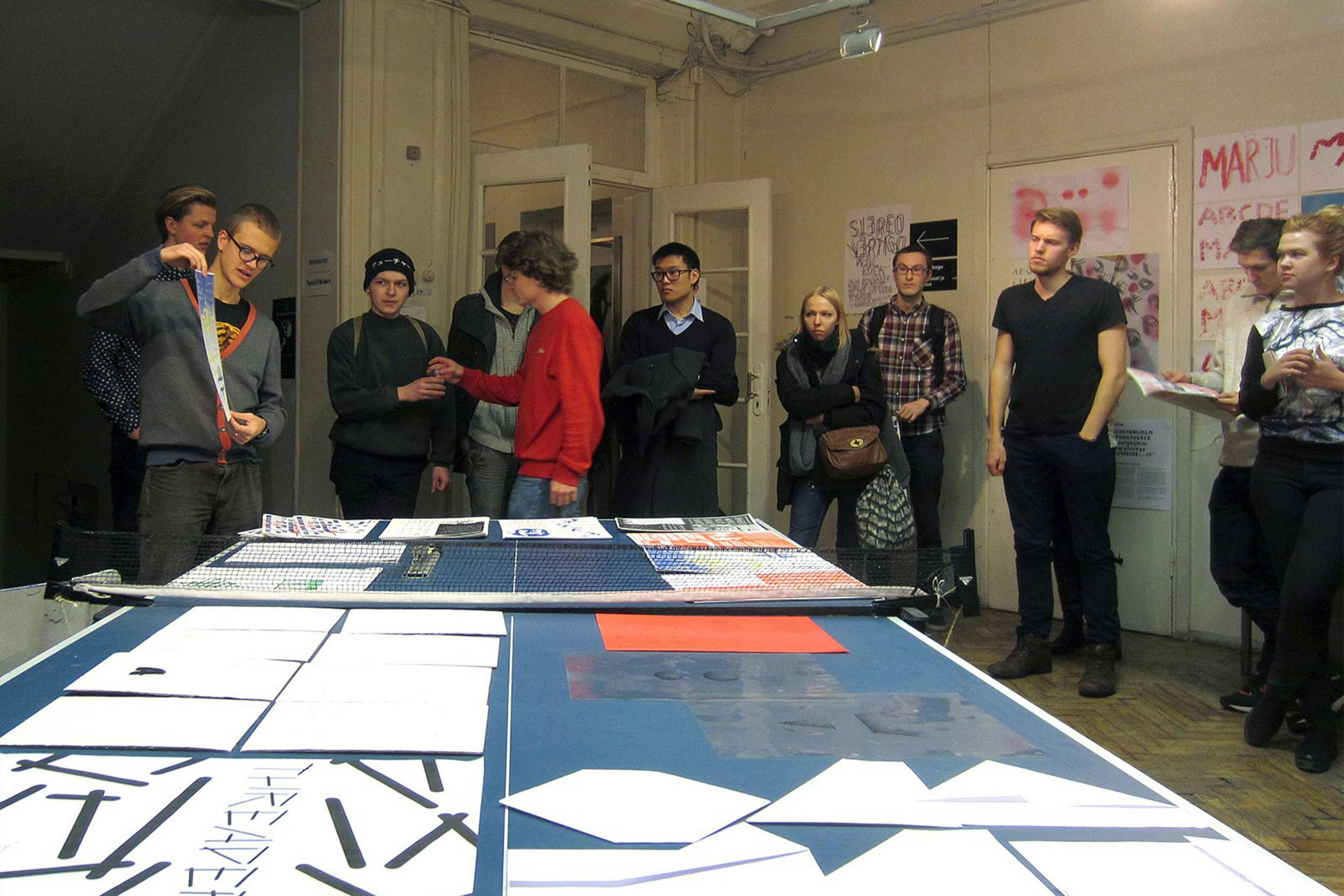
From 2013 to 2016, we studied together in the Graphic Design department at the Estonian Academy of Arts (EKA), where we also discovered our passion for typefaces. Our main influencers were Ivar Sakk, whose legendary lectures on the history of typography we still remember vividly; the founders of Dinamo type design studio Fabian Harb and Johannes Breyer, who gave us a workshop during our second year that was a game-changer for us and, of course, Indrek “The Matchmaker” Sirkel because without him none of these connections would have happened.
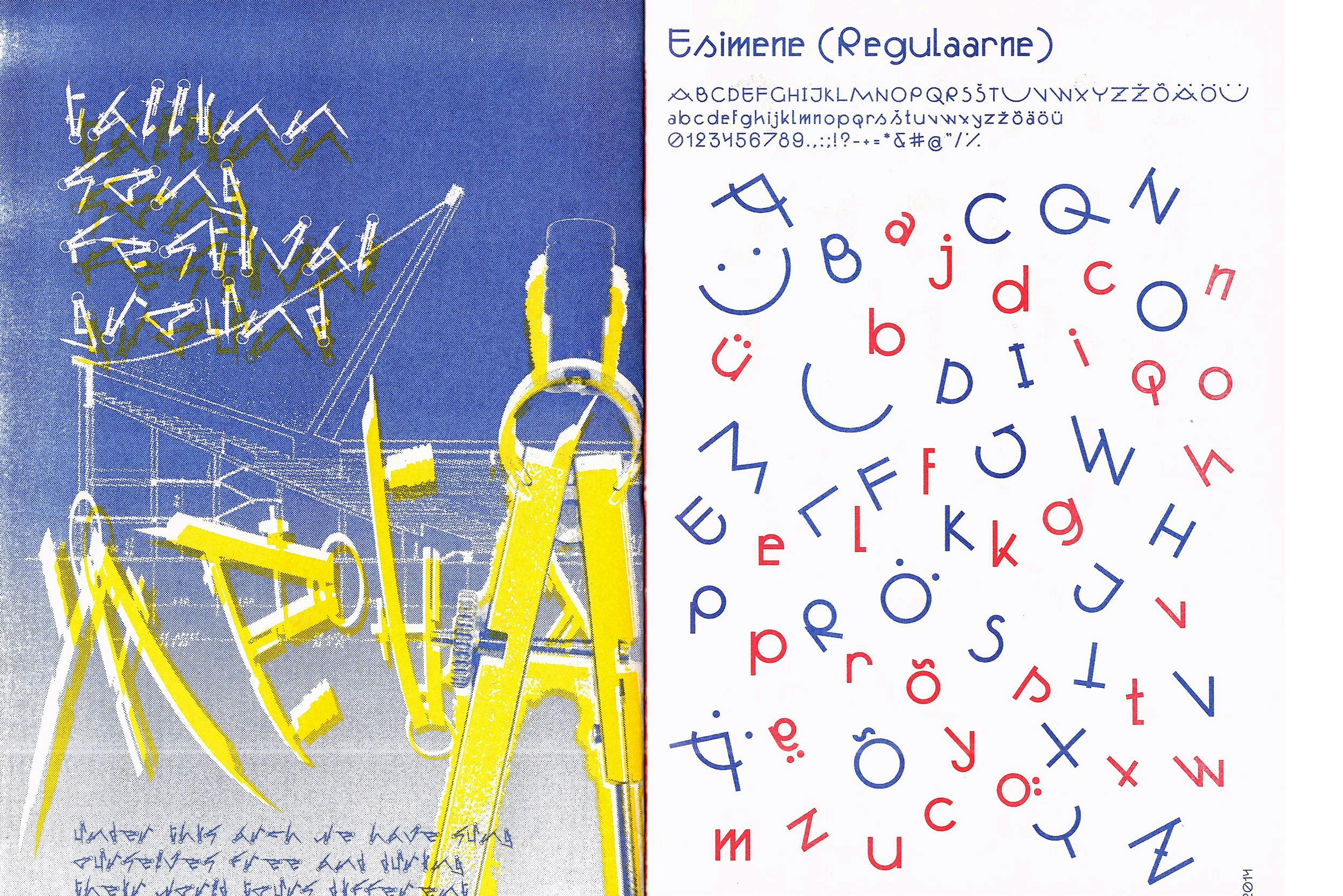
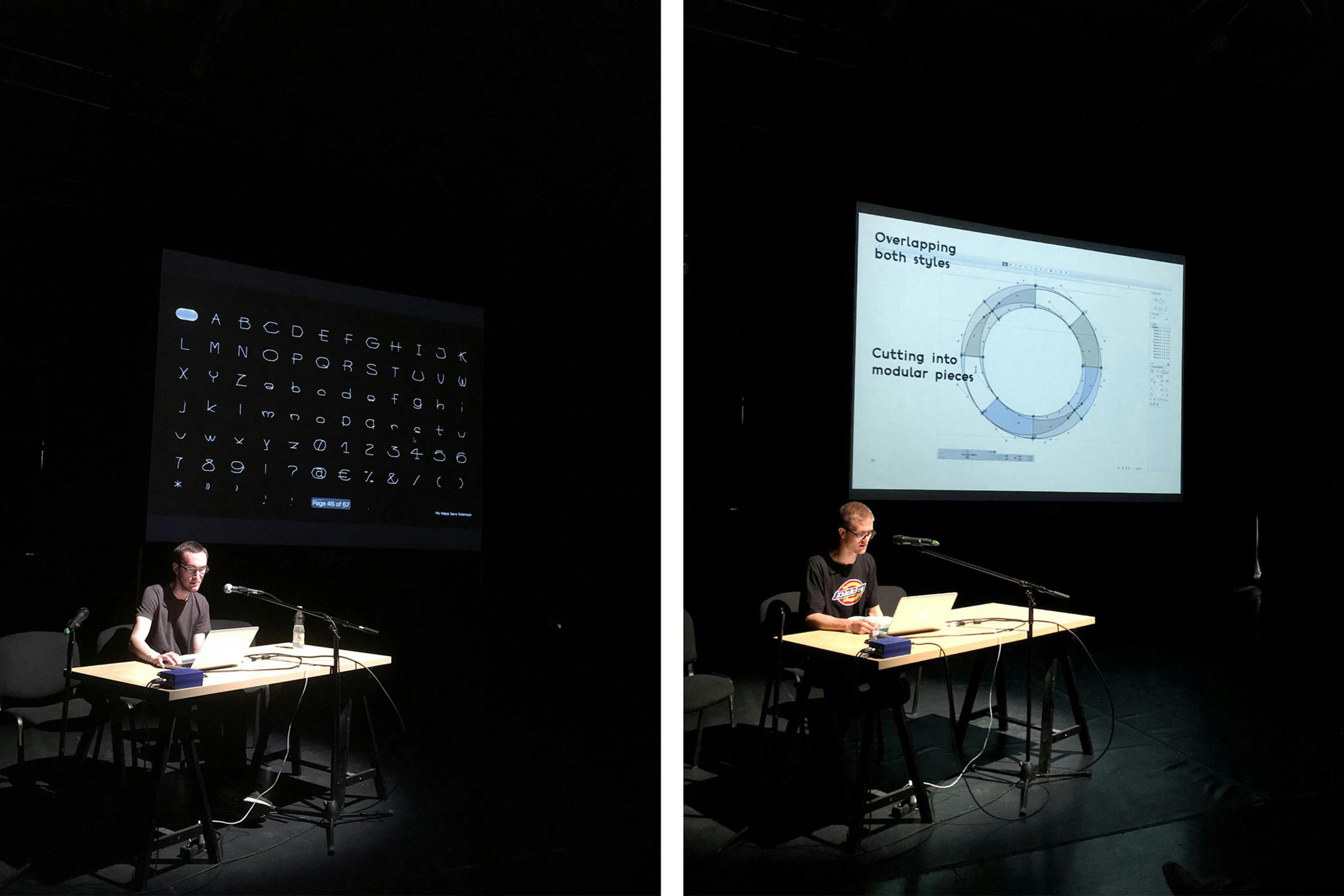
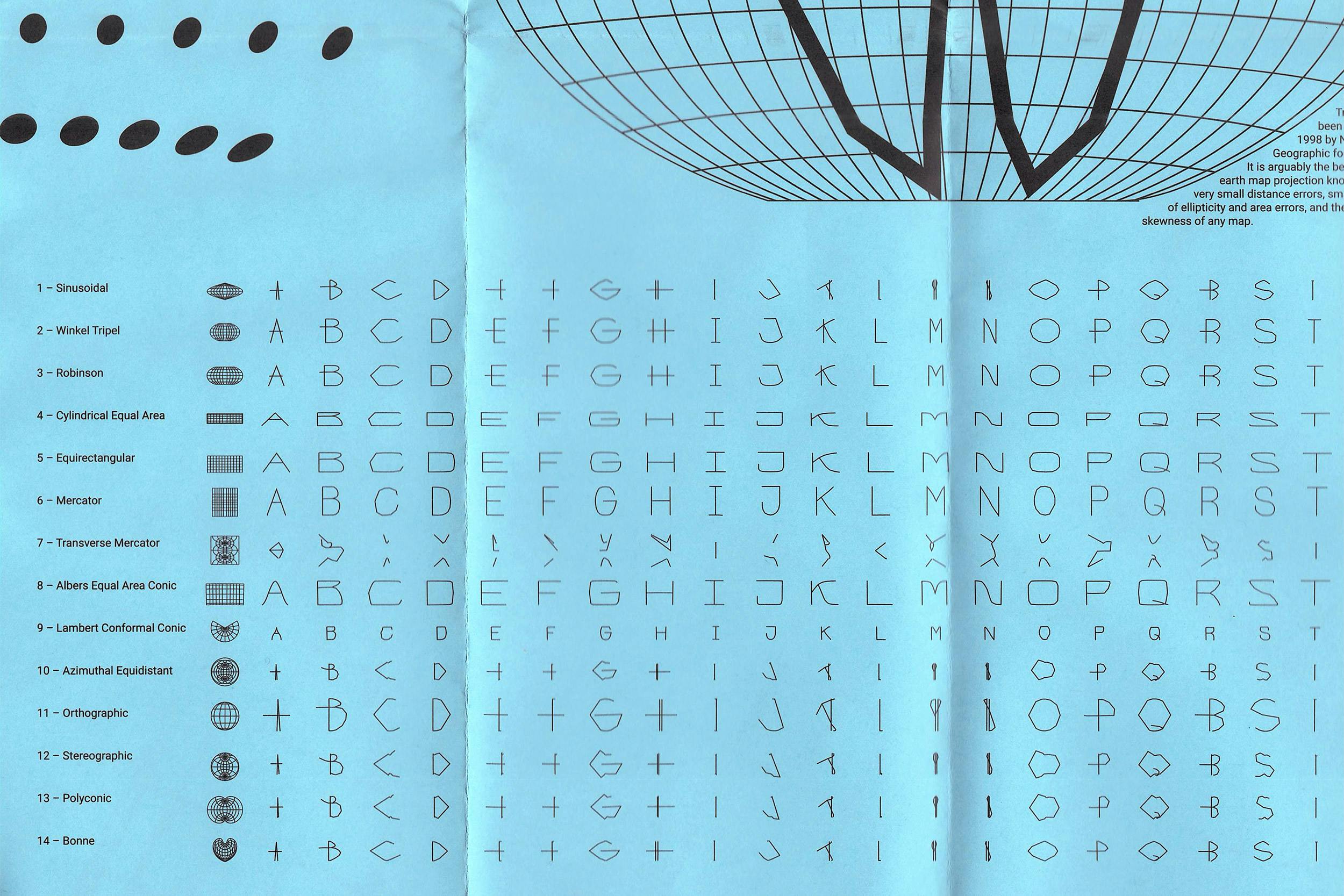
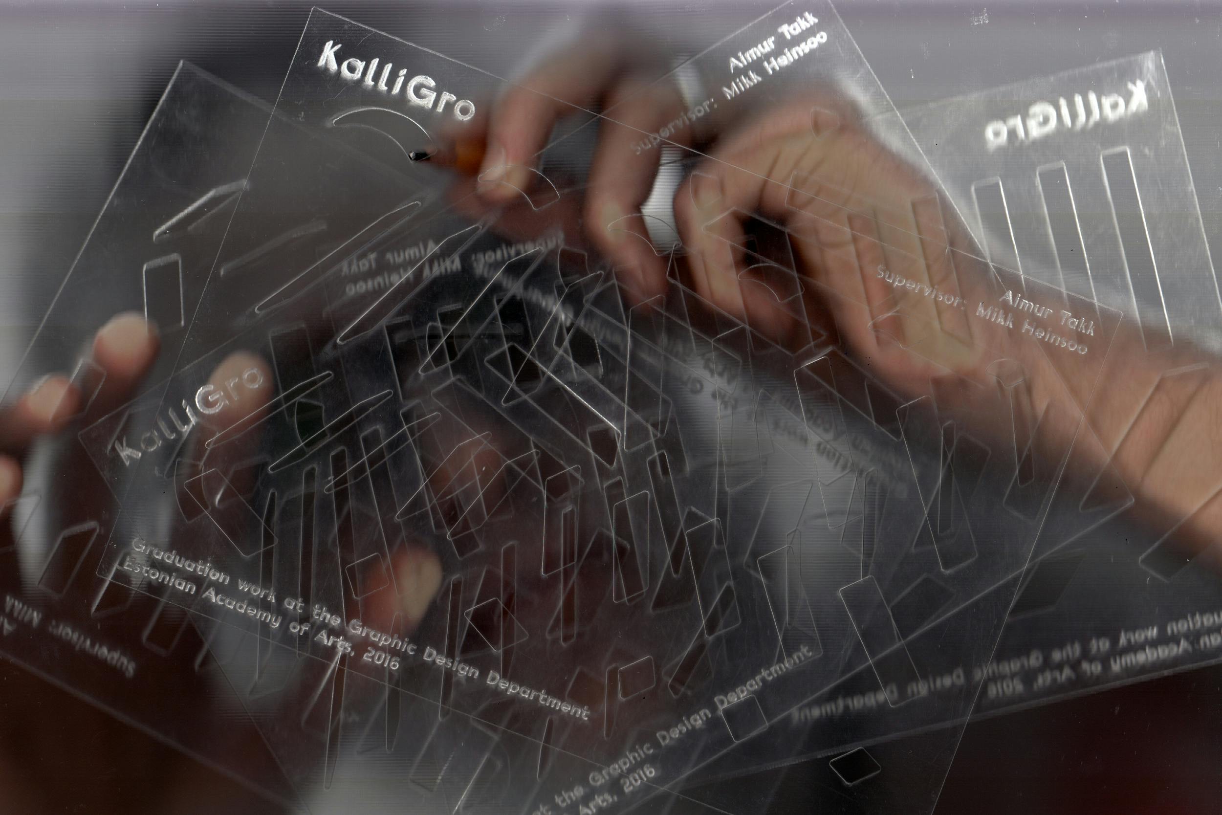
We finished our BA in 2016 and made a bunch of fonts for our thesis projects. Aimur’s KalliGro is a typeface system that uses modular components to incorporate elements from calligraphy and Grotesk typefaces into one. Andree was trying to draw fonts in different online apps that had primitive line-drawing functionality but weren’t proper design software. One of the most interesting experiments was the My Maps Sans typeface family, initially drawn in Google’s My Maps app, from where the line art letters were exported, reshaped by 14 different map projections via IndieMapper, and finally reassembled in Glyphs into 14 fonts.
After our studies, we weren’t ready to launch a studio right away, but during the dawn hours after our graduation in a hazy local dive bar, a plan that would later become Tüpokompanii was forged. In the following years, Aimur started his MA studies at EKA, did an internship at AKU, designed typefaces for ERKI Fashion Show (2017), Tallinn Music Week (2018), IDA Radio (2018), and also studied at ECAL (2018–2020), but history is silent about that part.
Meanwhile, Andree continued to learn type design on his own and started practicing under the Kirjatehnika moniker. He sought alternative means of education, luckily landing an internship position at Commercial Type (2017), started working as a collaborator on different typeface projects with Dinamo (2018–…), worked as a graphic designer at Stuudio Stuudio (2018–2020), and has been a guest lecturer at EKA since 2018.
After these detours and both back in Tallinn in 2020, the idea of starting a foundry together came back into the picture. Since we’re constantly in touch about each other’s work, it made sense for us to create a collaborative platform for releasing our typefaces (and maybe others in the future) instead of each of us agonizing on our own. Over the years, we had accumulated a long list of possible names for the foundry, but Tüpokompanii had stuck around the longest. We like its neutrality, recognizability in different languages, and the wordplay on typos.
Thinking about where we are positioned in the general type design scene, our distinguishing feature might be a certain inherent Estonian-as-peripheral vantage point, while not being ashamed of our underdog past, but trying to find ways to turn it into our advantage. Our local typographic landscape is seemingly quite sparse, and the feeling of always jogging behind western influences is common, but we believe it’s time to rediscover and rejuvenate the material that has been foreshadowed by amateurism and technological inferiority, in a contemporary way. We try to continue to look at typefaces through the eyes of a graphic designer and find exciting visual solutions through a meaningful disruption of conventional approaches in type design.