Custom fonts for the city of Tartu
Design collective AKU approached us in the spring of 2022 to design a custom typeface for the city of Tartu, the second-largest in Estonia. It’s not exactly every day that one gets an offer like this so we eagerly got on board. The initial brief called for a typeface that could “time-travel” by having two sets of alternate characters next to the default style, one looking to the past and the other facing the future. As the budget was limited, the option to use an existing open-source typeface as the starting point was also discussed but we politely declined this compromise and took a typeface that Andree had secretly been drawing as the initial basis to work with.
We met once a week with AKU to discuss our progress and were given access to a shared Figma file where we could be the flies on the wall observing the development of the visual identity system. After a couple of feedback rounds, it was going okay but we felt like something was still missing at the core. The keywords “past, present, future” were becoming too restrictive, and it was difficult not to step into the usual clichés. Also, it wasn’t completely clear yet in what contexts the different font styles would be used.
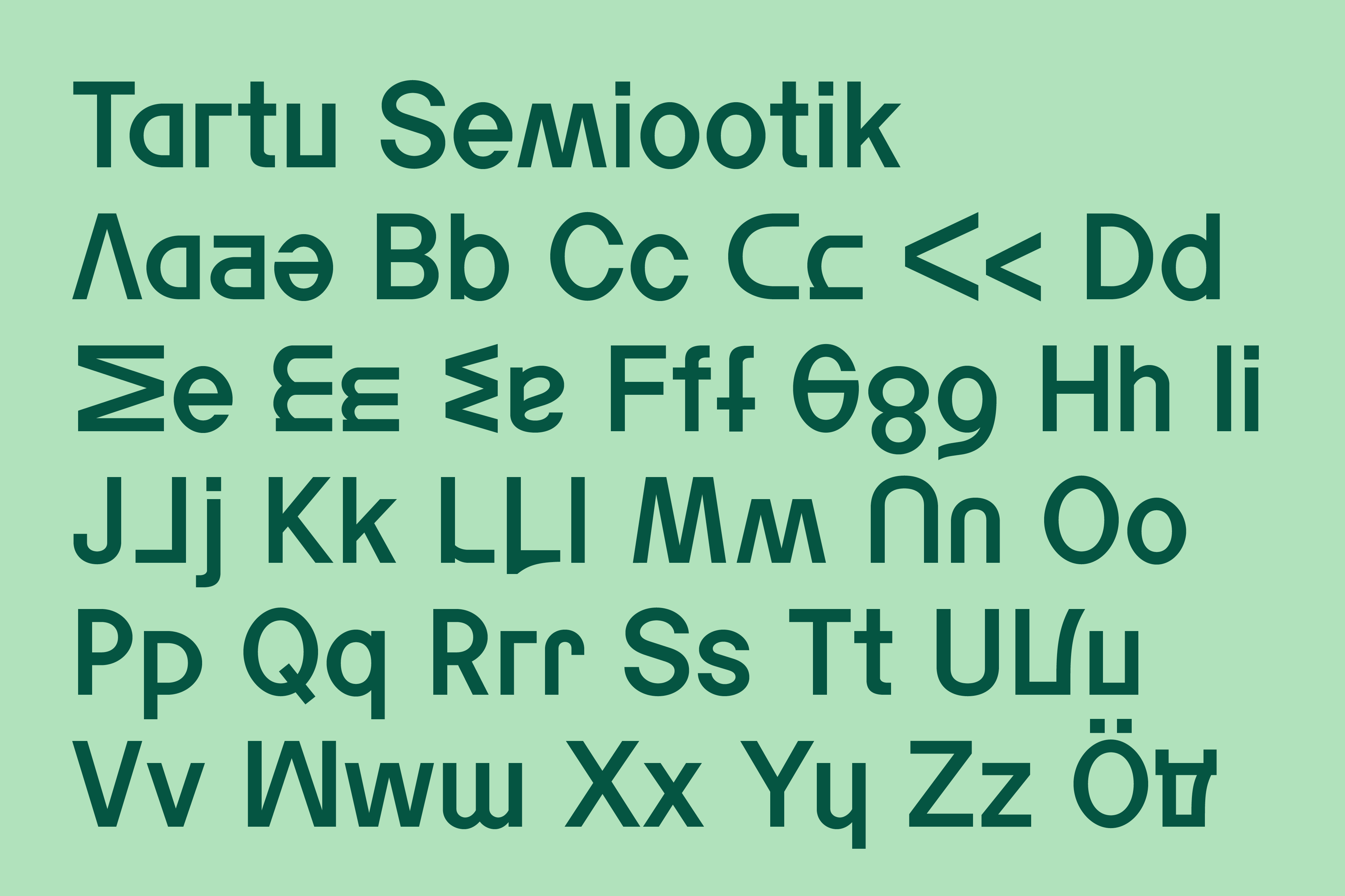
Semiootik
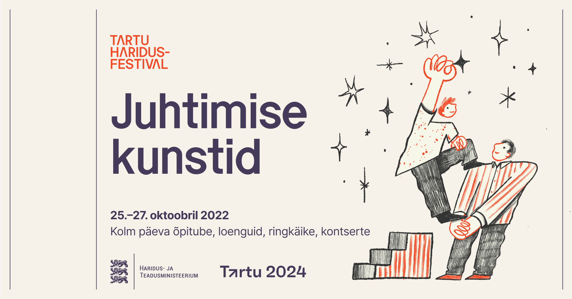
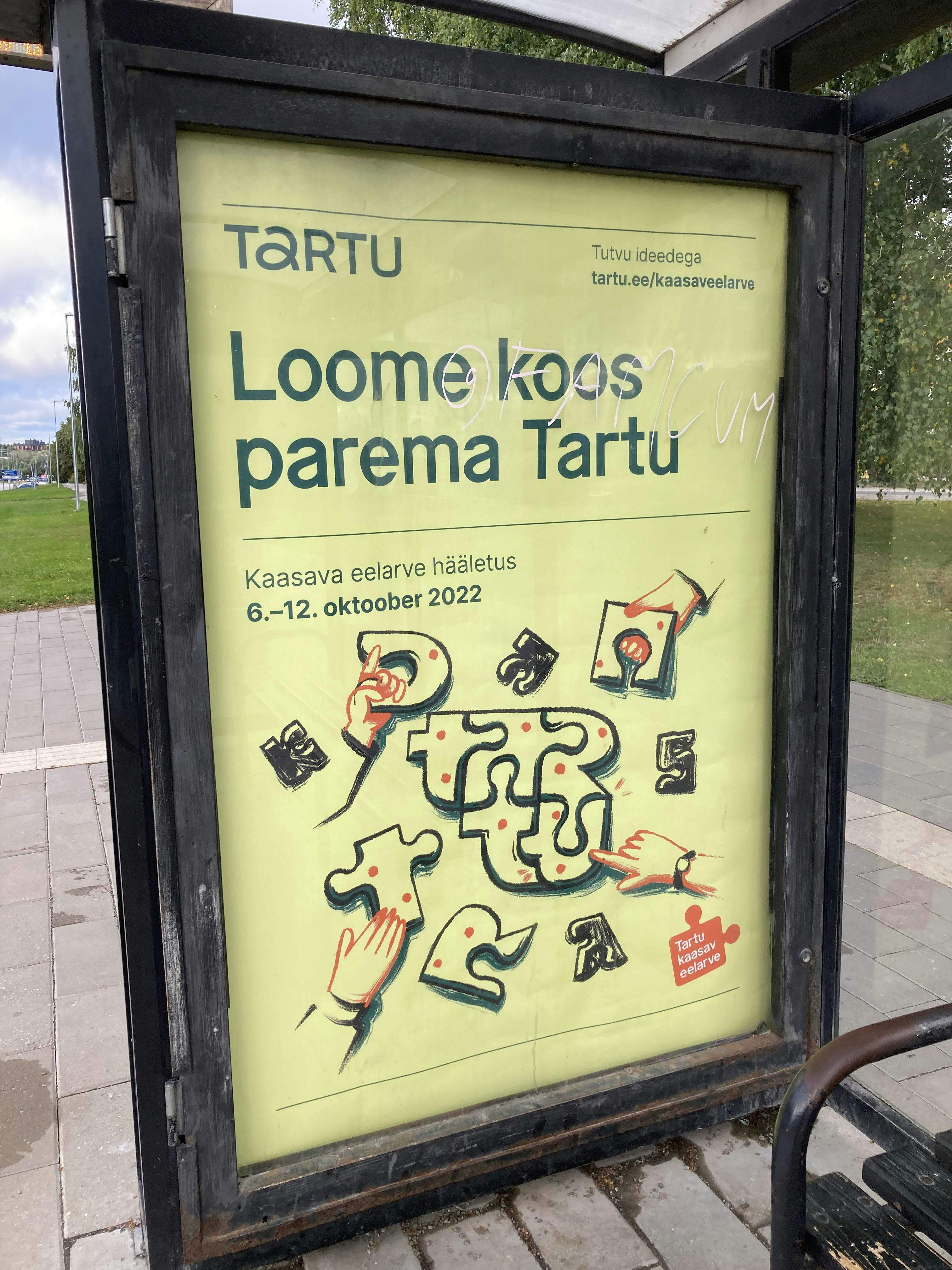
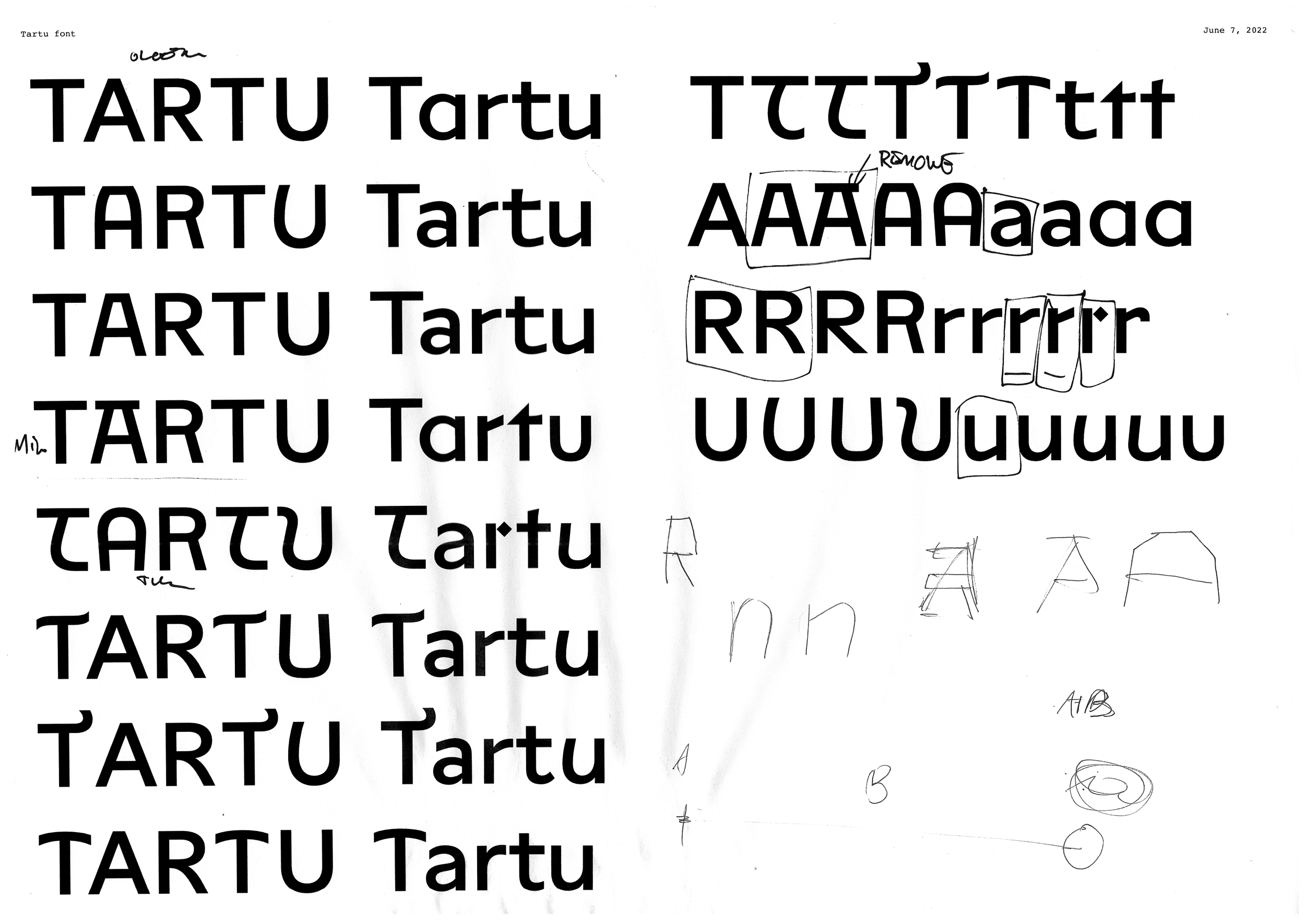
Incidentally, around the same time, Aimur had a discussion about the project with Henri Papson, our friend and consigliere. They were trying to think about what are the unique characteristics of Tartu and how to reflect them in the typeface. Tartu is a well-known university town in the whole Baltic region and one of the most prominent figures in the academic field was Juri Lotman, the founder of the Tartu–Moscow Semiotic School. The connection to semiotics gave us a good excuse to realize a thought experiment that Aimur had pondered some time ago – by flipping and turning letters they start to resemble other characters and thus change their meaning. This trick helped us solve our uncertainties with the original “time-traveling typeface” idea. Not only did it feel like the typeface started designing itself but also the semiotics-inspired style found its logical usage context for cultural-orientated communication. The number of possibilities seemed endless and it became a sort of brain teaser game for us to see how many letter-flipping options we could spot (don’t even get us started with numb3r5!). We tested around 50 combinations and ended up with a selection of 21 alternate forms in the final typeface.

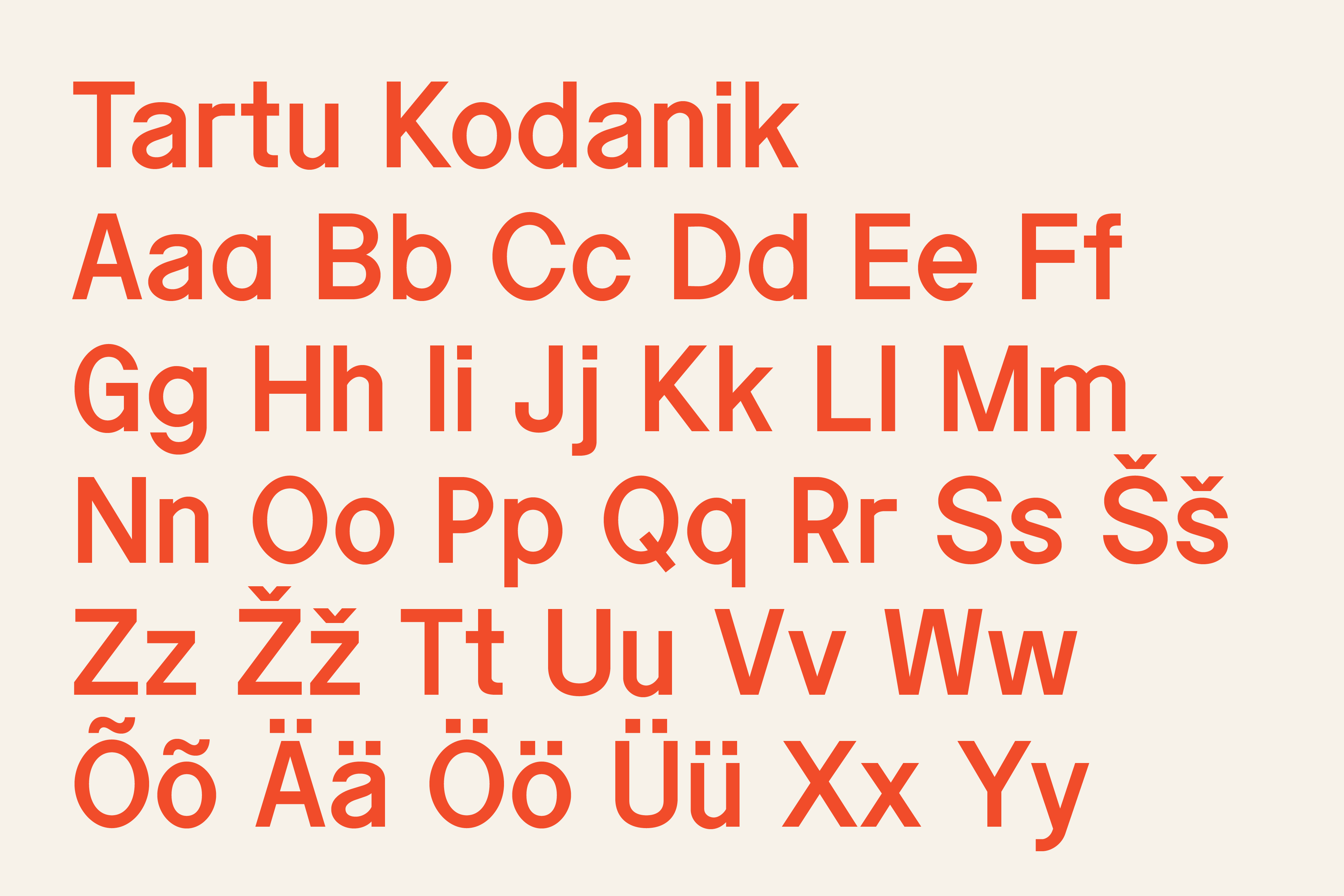
Kodanik
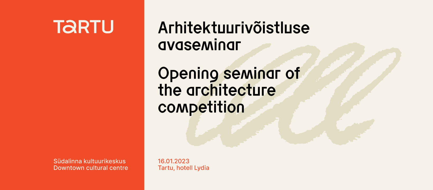
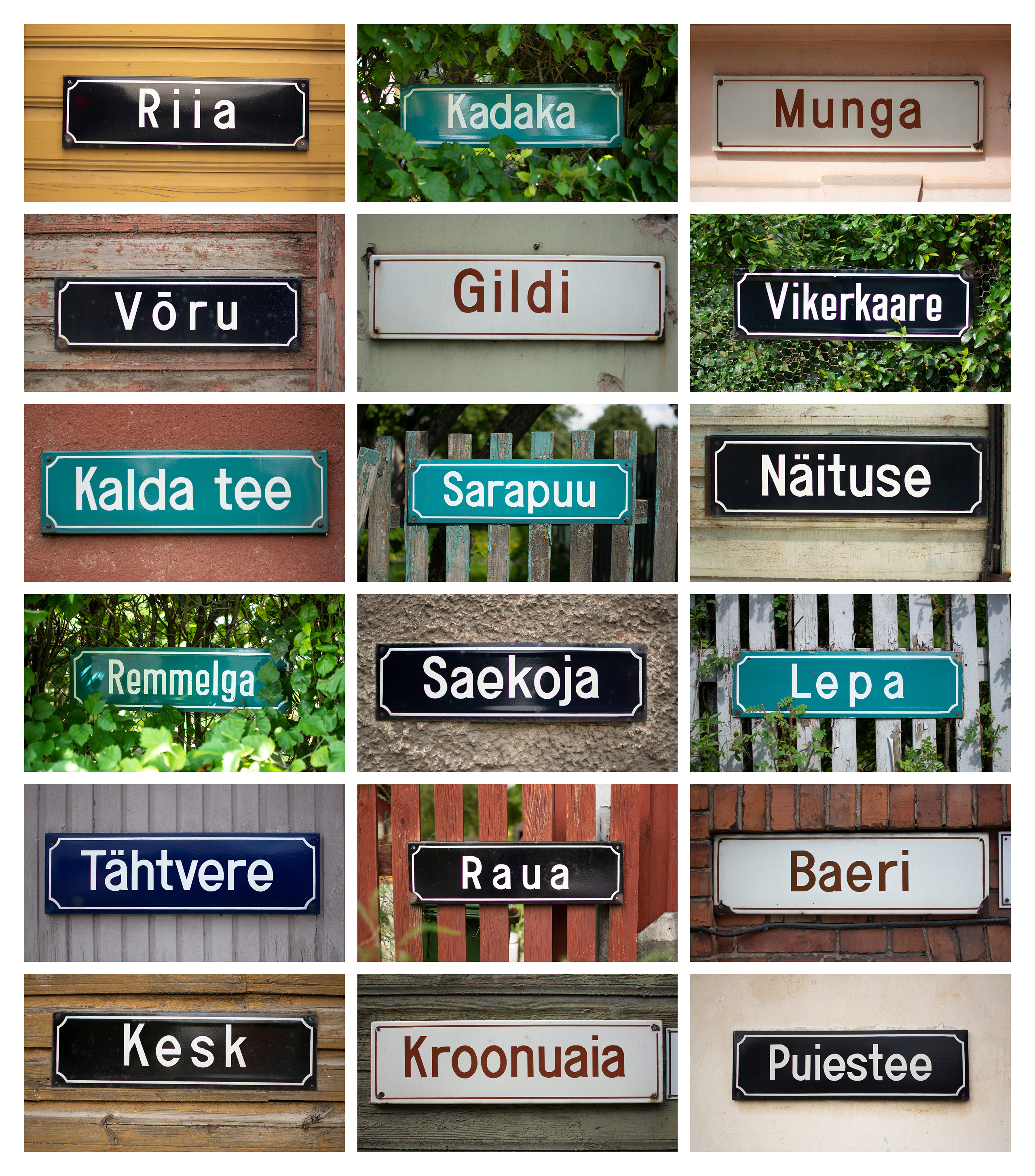
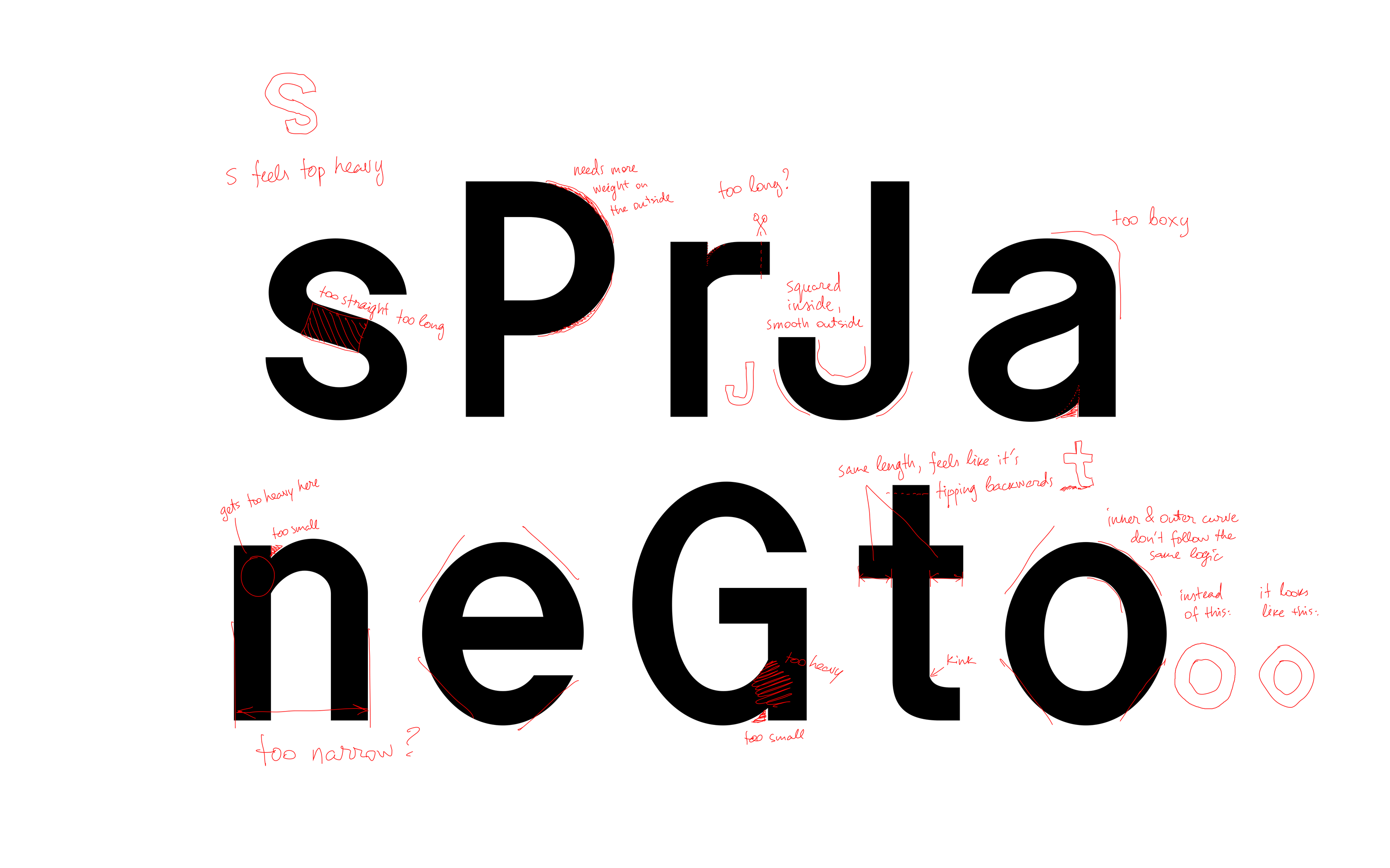
Simultaneously, we also reconsidered the formal references of the typeface and wanted to tie it more closely to the local context. One warm summer day Andree got on a train to Tartu to capture the many old hand-painted enamel street signs that are still commonly used in Tartu. Riding a bicycle for easier navigation and with a camera mounted on a monopod (like a tripod but with one leg) to be able to get up close and personal, he documented 48 signs in different parts of the city which then became the formal source material for the typeface. We took Ladna as the basis to speed up the process, changed the proportions and completely reworked all characters in the font. We aimed to match the spirit of the sign-painter and keep as many quirks of the street signs in the final typeface as possible and not to iron them out from the vector shapes which is somewhat counter-intuitive to our habits as type designers.
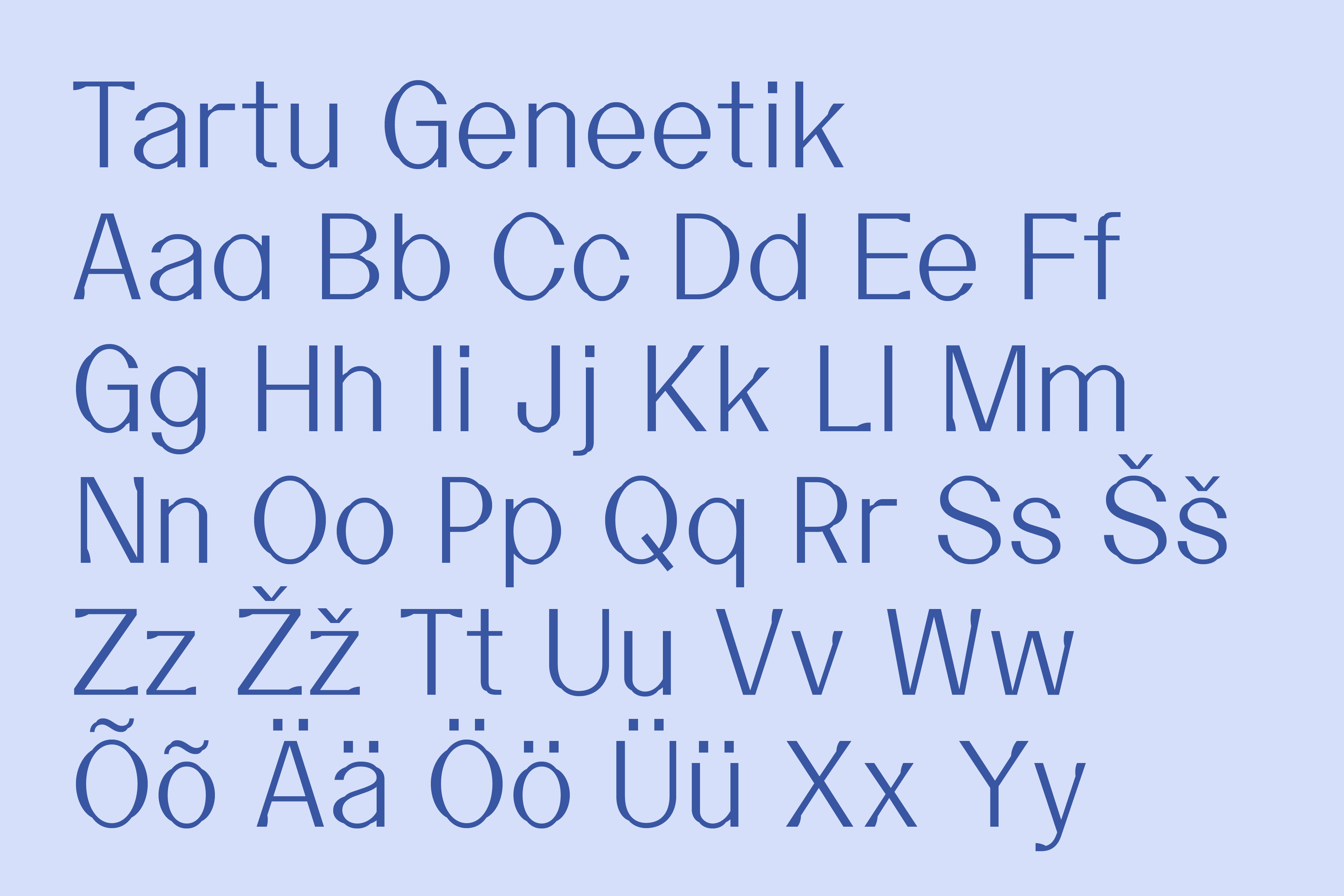
Geneetik
By this time it was clear that the two font styles would be able to hold the identity system together nicely and cover almost all use cases appropriately. The only situation where the street-sign-inspired roughness didn’t do the team at AKU any favors was when they had to design the template for a formal letter of thanks a.k.a. the Designer’s Dream Job. While technically it was possible to make it work, we started to see that there would be more situations that would benefit from a third contrasting style to seal the deal. The idea of swash capital letters seemed intriguing initially, but after trying out several stylistic approaches to the swashes, they still didn’t seem to click. Cold… Then we drew a lighter weight to have some contrast next to the other two styles. Warmer… Finally thinking again about the imaginary sign-painter and putting on their hat, we envisioned a scenario where they are asked to draw something elegant but the paint keeps running out halfway through the brushstrokes so the result is a little bumpy but still delicate. Bingo! The shapes also resemble a parabola or a DNA sequence which came in handy when it was time to name the fonts. As a final step, we decided to name the typefaces by thinking of them as characters in the city: Tartu Kodanik (Citizen), Semiootik (Semiotician), and Geneetik (Geneticist).

Logo
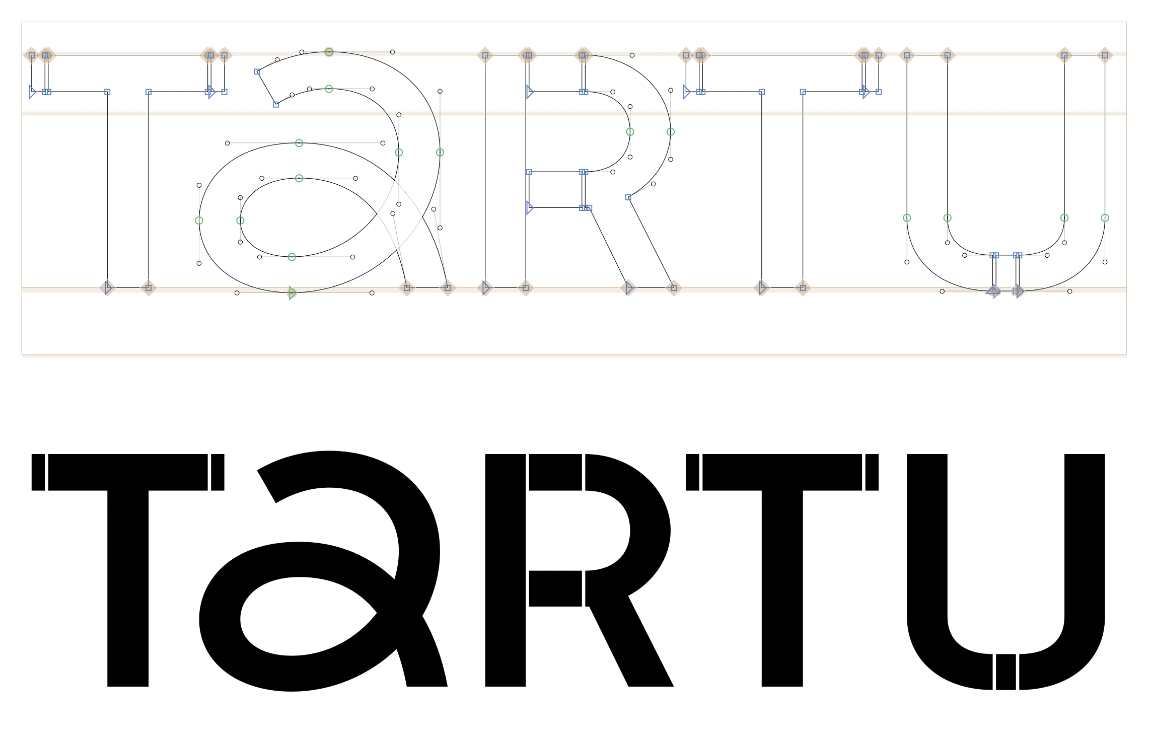
During the process, we proposed some logo solutions as well, not to mention the hundreds of sketches by AKU, that didn’t make the cut for better or worse. Finally, once the direction of the logo had been settled, we helped to make finishing refinements to it. The T R T U letters were taken from Tartu Kodanik and widened to match the width of the spiral-shaped A by robustly inserting extensions, maintaining a connection to its street-sign origins.
Conclusion
All in all, it has been a real milestone project for us. The first typeface we made collaboratively and the biggest client for both of us so far. We’re truly thankful to AKU and Tartu City Government for trusting us. The road had many unexpected twists and turns but we’re glad our opinions were taken into account and we got to realize our vision without having to make unnecessary compromises.